Myvar - A Decision-Support Platform for Seed Selection
UX DesignUI DesignAgricultureFrance
www.myvar.frMyvar is an online tool that helps French oilseed farmers pick the right seed varieties based on regional and agronomic criteria. It used to live in an Excel file, hard to maintain and not built for field use. I led the full UX/UI design to turn it into a web app, working with a project manager, a developer, and the client's PO.
CHALLENGE
Making complex agricultural data usable for farmers who spend their days outside, not in front of a screen, without oversimplifying the information they rely on.
UX PROCESS
Benchmark of similar tools, followed by a co-creation workshop with the client team to define user journeys and prioritize the information to display. Wireframes to lay out the page structure before moving into interface design.
DESIGN SOLUTIONS
Pages built around real workflows, filtering and search available from the home screen, typography and colours chosen for readability.
Trickiest part: dense data tables on mobile. Fix: fixed left column, horizontal scroll.
RESULTS
Since the redesign, the site has maintained around 210,000 page views and 35,000 users per year. At the review presented to the board in late 2023: +123% in users and +282% in average time spent on site compared to the previous version.
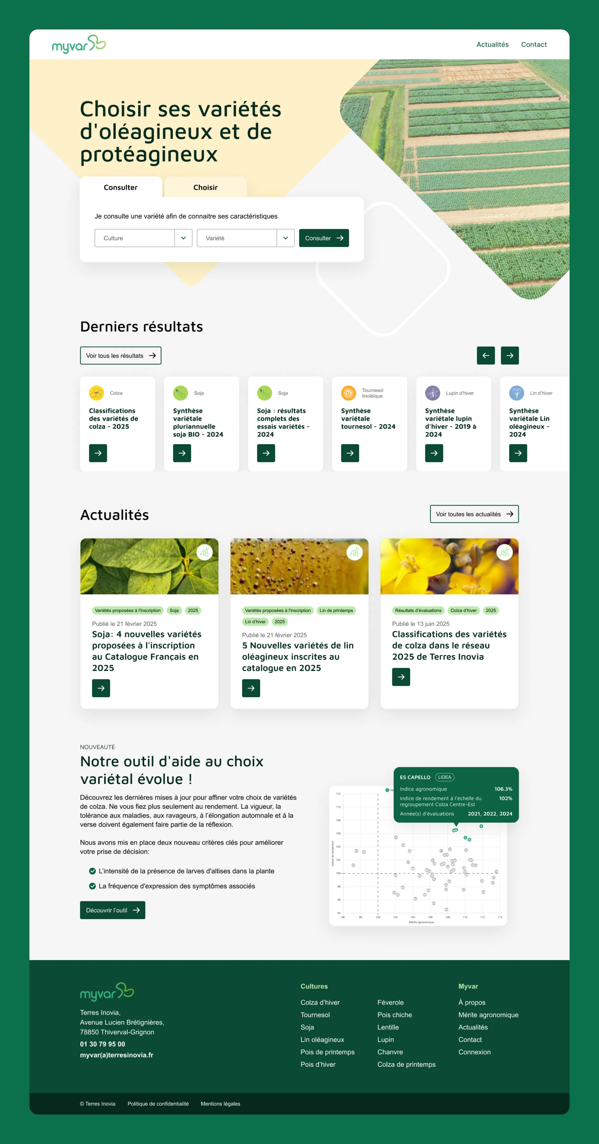
Home page built around two user intents: look up a known variety, or find one based on agronomic criteria. Search first, everything else below.
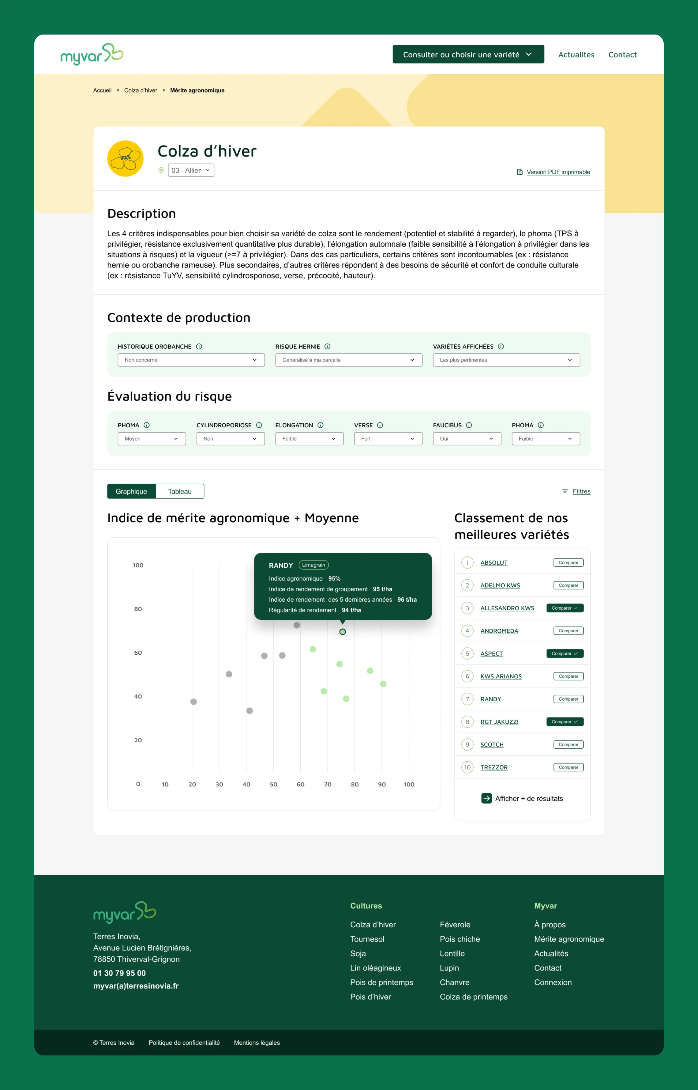
Variety detail page: complex agronomic data organised through progressive filtering, a scatter plot for comparison, and a ranked list to support the final decision.
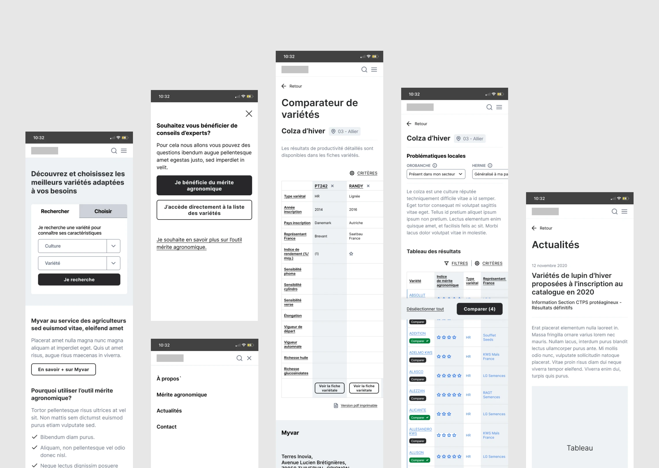
Mobile wireframes showing the structure and user flow of the decision-making tool.
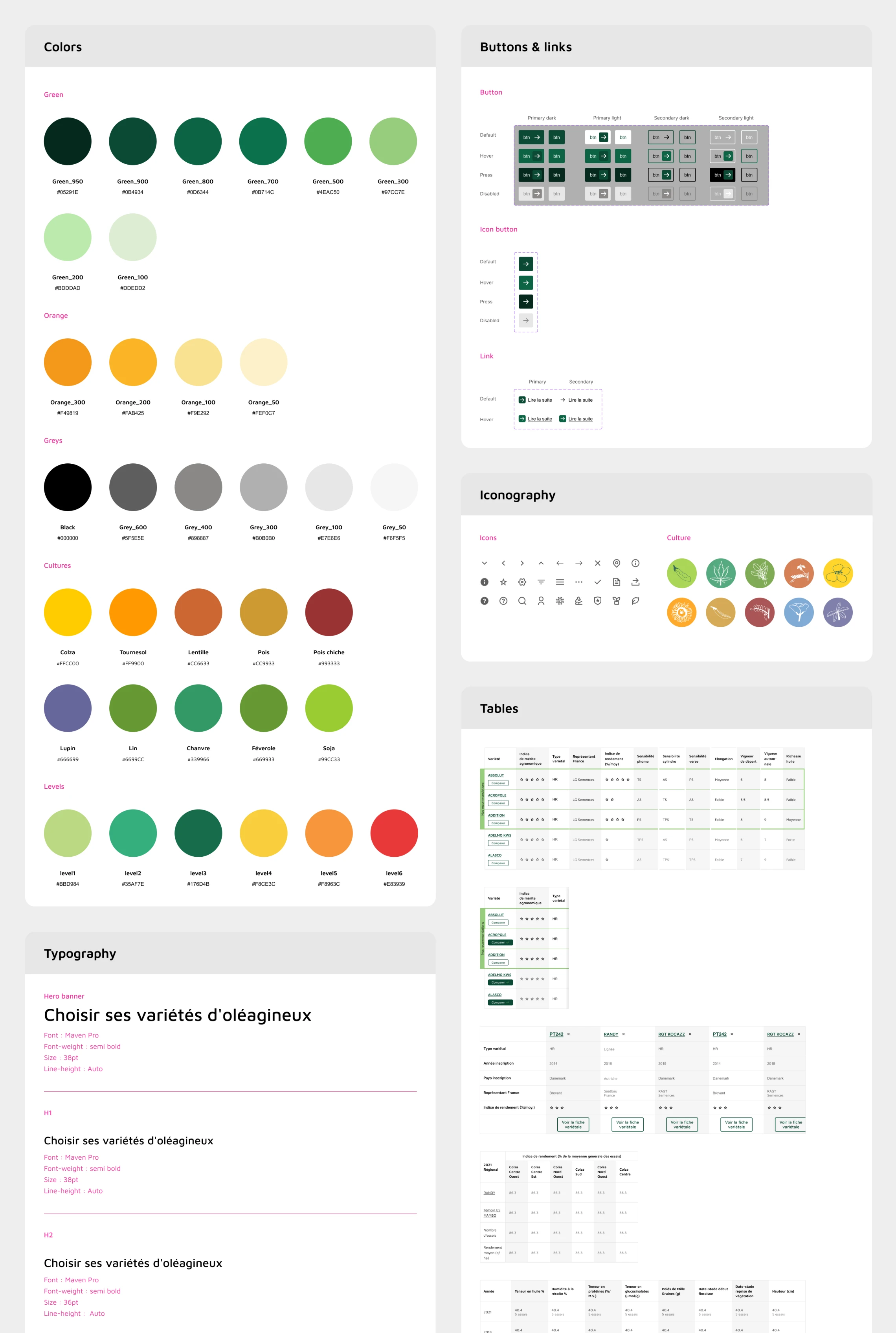
Component library built in Figma: colours, typography, iconography, and interactive components with all states, designed to ensure consistency across breakpoints and streamline developer handoff.
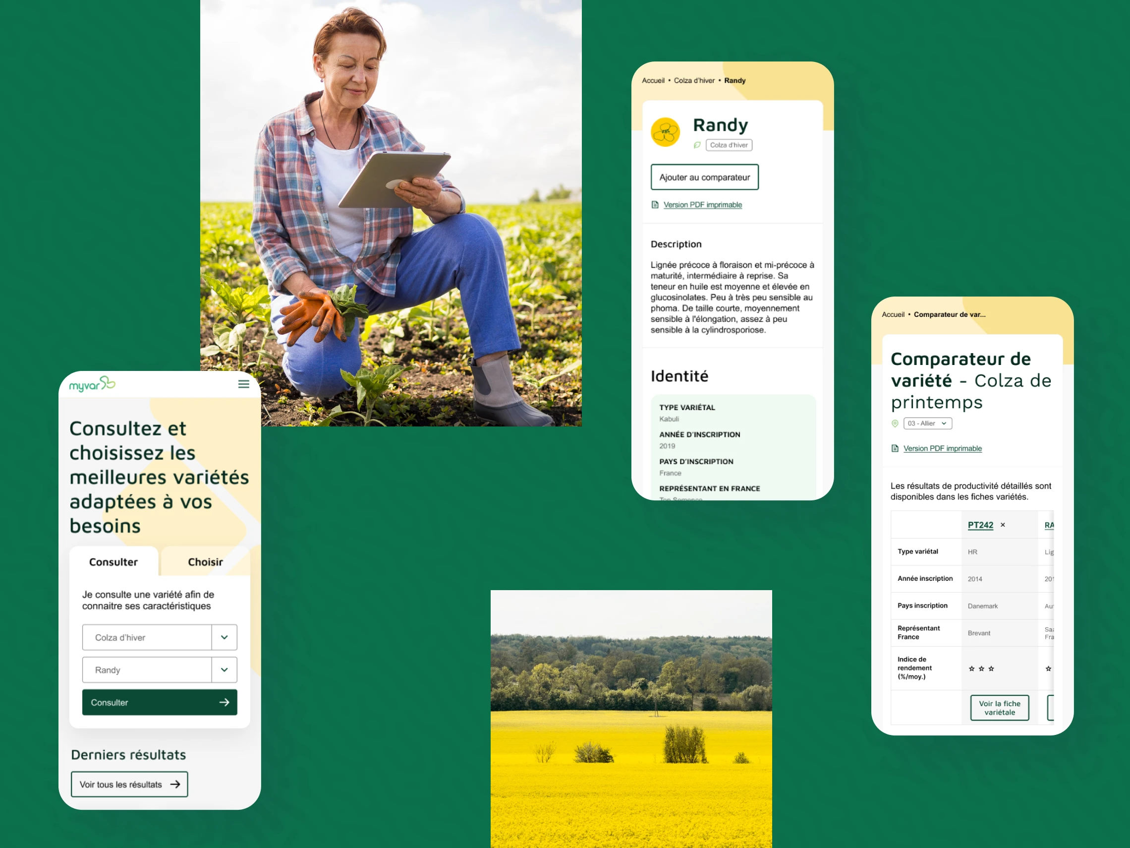
Responsive design views ensuring smooth access to key features and insights across all screen sizes.
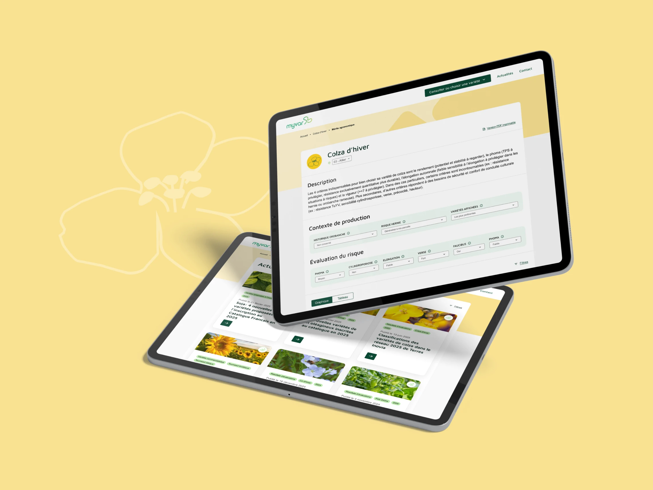
Tablet views of the platform, striking a balance between readability, usability, and data complexity.